Styling tables
Styling an HTML table isn't the most glamorous job in the world, but sometimes we all have to do it. This article explains how to make HTML tables look good, with some specific table styling techniques highlighted.
| Prerequisites: | Basic HTML syntax and HTML tables, CSS Values and units and Sizing. |
|---|---|
| Learning outcomes: |
|
A typical HTML table
Let's start by looking at a typical HTML table. Well, I say typical — most HTML table examples are about shoes, or the weather, or employees; we decided to make things more interesting by making it about famous punk bands from the UK. The markup looks like so:
<table>
  <caption>
    A summary of the UK's most famous punk bands
  </caption>
  <thead>
    <tr>
      <th scope="col">Band</th>
      <th scope="col">Year formed</th>
      <th scope="col">No. of Albums</th>
      <th scope="col">Most famous song</th>
    </tr>
  </thead>
  <tbody>
    <tr>
      <th scope="row">Buzzcocks</th>
      <td>1976</td>
      <td>9</td>
      <td>Ever fallen in love (with someone you shouldn't've)</td>
    </tr>
    <tr>
      <th scope="row">The Clash</th>
      <td>1976</td>
      <td>6</td>
      <td>London Calling</td>
    </tr>
    <tr>
      <th scope="row">The Damned</th>
      <td>1976</td>
      <td>10</td>
      <td>Smash it up</td>
    </tr>
    <tr>
      <th scope="row">Sex Pistols</th>
      <td>1975</td>
      <td>1</td>
      <td>Anarchy in the UK</td>
    </tr>
    <tr>
      <th scope="row">Sham 69</th>
      <td>1976</td>
      <td>13</td>
      <td>If The Kids Are United</td>
    </tr>
    <tr>
      <th scope="row">Siouxsie and the Banshees</th>
      <td>1976</td>
      <td>11</td>
      <td>Hong Kong Garden</td>
    </tr>
    <tr>
      <th scope="row">Stiff Little Fingers</th>
      <td>1977</td>
      <td>10</td>
      <td>Suspect Device</td>
    </tr>
    <tr>
      <th scope="row">The Stranglers</th>
      <td>1974</td>
      <td>17</td>
      <td>No More Heroes</td>
    </tr>
  </tbody>
  <tfoot>
    <tr>
      <th scope="row" colspan="2">Total albums</th>
      <td colspan="2">77</td>
    </tr>
  </tfoot>
</table>
The table is nicely marked up, easily stylable, and accessible, thanks to features such as scope, <caption>, <thead>, <tbody>, etc. Unfortunately, it doesn't look that great. With only the default browser styling it looks cramped, hard to read, and a little boring:
We need to use some CSS to fix this up. You can style a table in any way you want using CSS. For example, we created this rather "punk" looking design:
However, this design is rather garish. In this article, we'll get you to mark it up using some best practices for table design — as outlined in Web Typography: designing tables to be read not looked at.
Getting started with styling our table
Let's work through styling our table example together.
-
To start with, make a local copy of the sample markup shown earlier and save it in a working directory somewhere on your local computer.
-
Next, create a new file called
style.cssand save it in the same directory as your other files. -
Link the CSS to the HTML by placing the following line of HTML inside your
<head>:html<link href="style.css" rel="stylesheet" />
Load your HTML into a browser to see how it looks by default.
Updating the font
This is a minor point, and not strictly relevant to styling tables, but we thought the default font looked a bit too formal for a table about punk bands. Start your CSS off by adding the following rule:
html {
  font-family: "Helvetica", "Arial", sans-serif;
}
Spacing
The first thing we need to do to our table is sort out the spacing — default table styling is so cramped! To do this, add the following CSS to the bottom of your style.css file:
table {
  table-layout: fixed;
  width: 90%;
  margin: 10px auto;
  border-collapse: collapse;
}

th,
td {
  padding: 0.6em;
}
The most important parts to note are as follows:
-
A
table-layoutvalue offixedis generally a good idea to set on your table, as it makes the table behave a bit more predictably by default. Normally, table columns tend to be sized according to how much content they contain, which produces some strange results. Withtable-layout: fixed, you can size your columns according to the width of their headings, and then deal with their content as appropriate. Chris Coyier discusses this technique in more detail in Fixed Table Layouts. -
We've coupled the fixed layout with a
widthof90%and amarginof10px auto. These settings mean that the table will mostly fill the viewport and be centered horizontally. -
A
border-collapsevalue ofcollapseis standard best practice for any table styling effort. By default, when you set borders on table elements, they will all have spacing between them, as the below image illustrates: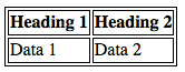 This doesn't look very nice (although it might be the look you want, who knows?). With
 border-collapse: collapse;set, the borders collapse down into one, which looks much better: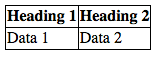
-
We've set some
paddingon the<th>and<td>elements — this gives the data items some space to breathe, making the table look a lot more legible.
Save your code and refresh your browser to see the results.
Alignment
Next up, we'll deal with alignment of the different types of data inside their cells. Best practice dictates that you should align text to the left and numbers to the right; the following CSS will achieve that, so add it to the bottom of your CSS file now.
tr :nth-child(2),
tr :nth-child(3) {
  text-align: right;
  width: 15%;
}

tr :nth-child(1),
tr :nth-child(4) {
  text-align: left;
  width: 35%;
}

tfoot tr :nth-child(1) {
  text-align: right;
}

tfoot tr :nth-child(2) {
  text-align: left;
}
We've used the :nth-child pseudo-class here; a useful selector that allows you to select a specific numbered child of an element, or a specific sequence. Here we are using it to select specific <td> elements inside the elements.
Note how we've also set specific widths on the table rows, with the rows containing text being set much wider than the rows containing numbers. This is a good idea — the rows containing more content need more space to give them as much chance as possible to have their content on one line. The rows containing less content don't need as much space to display their data, and in fact if you give them lots of space, the data gets a bit lost in the space and is therefore harder to read.
We should also make sure that our data items are aligned to the top of their cells, rather than the middle. To achieve this, we can use the vertical-align property. Update your existing th, td rule to the following:
th,
td {
  vertical-align: top;
  padding: 0.3em;
}
Again, save and refresh to see the effect of your latest CSS updates.
Adding borders
The table is looking much better already, but we should add some borders to provide visual separation between the table <caption>, the data, and the total row at the bottom. To do this, add the following rules to your CSS:
tfoot {
  border-top: 1px solid #999999;
}
Next, update your existing table rule to the following:
table {
  table-layout: fixed;
  width: 90%;
  margin: 10px auto;
  border-collapse: collapse;
  border-top: 1px solid #999999;
  border-bottom: 1px solid #999999;
}
Save and refresh; your table should be starting to look pretty readable now!
Zebra striping
We wanted to dedicate a separate section to showing you how to implement zebra stripes — alternating rows of color that make the different data rows in your table easier to parse and read. Add the following CSS to the bottom of your style.css file:
tbody tr:nth-child(odd) {
  background-color: #eeeeee;
}
Earlier on you saw the :nth-child selector being used to select specific child elements. It can also be given a formula as a parameter, so it will select a sequence of elements. The formula 2n+1 would select all the odd numbered children (1, 3, 5, etc.) and the formula 2n would select all the even numbered children (2, 4, 6, etc.) We've used the odd keyword in our code, which is a shortcut for the 2n+1 formula (even is shorthand for 2n).
Again, don't forget to save and refresh to see the result.
Styling the caption
There is one last thing to do with our table — style the caption. To do this, add the following to the bottom of your style.css file:
caption {
  padding: 1em;
  font-style: italic;
  caption-side: bottom;
  letter-spacing: 1px;
}
There is nothing remarkable here, except for the caption-side property, which has been given a value of bottom. This causes the caption to be positioned on the bottom of the table.
Finished table
Your finished table design should look like so:
Table styling quick tips
Before moving on, we thought we'd provide you with a quick list of the most useful points illustrated above:
- Make your table markup as simple as possible, and keep things flexible.
- Use
table-layout: fixedto create a more predictable table layout that allows you to easily set column widths by settingwidthon their headings (<th>). - Use
border-collapse: collapseto make table elements borders collapse into each other, producing a neater and easier to control look. - Use
<thead>,<tbody>, and<tfoot>to break up your table into logical chunks and provide extra places to apply CSS to, so it is easier to layer styles on top of one another if required. - Use zebra striping to make alternative rows easier to read.
- Use
text-alignto line up your<th>and<td>text, to make things neater and easier to follow.
Summary
With styling tables now behind us, we need something else to occupy our time. The next article explores debugging CSS — how to solve problems such as layouts not looking like they should, or properties not applying when you think they should. This includes information on using browser DevTools to find solutions to your problems.